In the last few months, Qlik has made significant improvements in the styling of visualizations, incorporating features that customers have been requesting for years. This includes the ability to control backgrounds, fonts, borders, shadows, and more. The recent addition of the layout container marks another step towards providing increased flexibility in dashboard creation, allowing users to craft beautiful, pixel-perfect visualizations without using custom themes and CSS magic.
In this article, we will explore a simple, yet powerful application of the layout container – hiding dashboard elements in a sidebar or popup window. By doing so, they become accessible only when required, leading to a clutter-free dashboard experience, free from distractions. Additionally, we will also look at some of the new styling options.
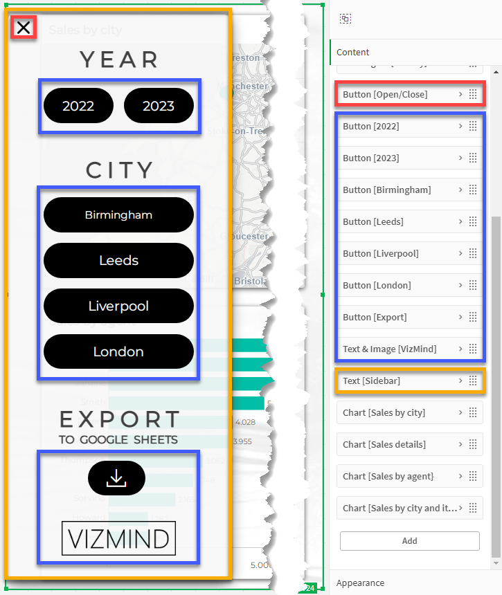
To start, create a variable called vShowMenu with a value of 0. For an in-depth guide on variables, check out Using the Variable Extension in Qlik Sense. Next, drag the layout container onto the sheet and resize it to match the sheet size. All charts we use will reside inside this container. To create the sidebar, add the Text object from the dashboard bundle to the layout container. It offers extended formatting options, such as changing text font and size, allowing you to customize the content to your preferences. To make it transparent, navigate to the chart properties:
Appearance > Presentation > Styling > General > Background color > By Expression
=ARGB(235, 248, 248, 248)
The first parameter defines the transparency. It can range from 0 (full transparency) to 255 (full opacity). Right underneath the background color options, you will find the border and shadow settings.
Now, position the elements you want in your sidebar on top of the text object. Our example uses buttons with a Toggle field selection action. To change the button color on click, apply the following expression in the chart properties:
Appearance > Presentation > Styling > Chart > Background options > Color > By Expression
=IF(WILDMATCH(GETFIELDSELECTIONS(Region), '*Leeds*'), '#00BFA6', '#000000')
The button at the bottom of the sidebar exports the straight table to Google Sheets. The process is explained in Storing a Table with Qlik Application Automation.
Lastly, create the open/close button. In the button properties, configure the following settings:
Actions and navigation
Action: Set variable value
Variable: vShowMenu
Value: =IF(vShowMenu=0, 1, 0)

Appearance > General
Label: =''

Appearance > Icon
Show icon: On
Icon: =IF(vShowMenu=0, 'Menu', 'Close')
Go to Appearance > Presentation > Styling > Chart to set the icon color and the object transparency. Make sure that the content of the layout container features the open/close button at the top and the Text object is placed under all remaining sidebar objects. The charts should be at the very bottom of the layout container.
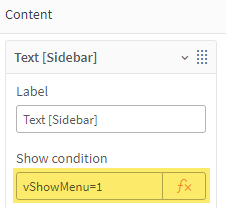
As a final step, for each sidebar object set the show condition to vShowMenu=1, like this:
Now every time you press the open/close button, the value of the variable will change and the sidebar objects will appear or disappear from the dashboard. You can apply the same logic to show and hide other objects such as natural language popups that appear on click. Do not forget to create a new variable for each open/close button.
Finally, while the layout container opens up plenty of possibilities, it is essential to make thoughtful design choices and always keep the end user’s needs in mind. Striking the right balance between functionality and simplicity is key to creating effective and user-friendly dashboards.