If I had to pick just one extension to use in Qlik Sense, there is no doubt that it would be the variable extension. Originally developed by Erik Wetterberg under the name qsVariable and now renamed to qlik-variable-input as part of the Qlik Sense Dashboard Bundle, this extension can add some dynamic features to your dashboard. In this article, I will share my five favorite use cases. Download the script and sample data, if you would like to follow along.
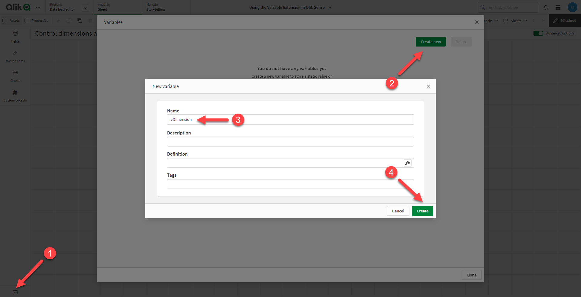
To get started, let us review some basics. First, we need to create the variables we want to use with the extension. To do this, switch to advanced edit mode and click on the icon in the bottom left corner while editing a sheet to open the variables dialog. Then, select Create new, give the variable a name, and click Create.
To use the variable extension, navigate to the assets panel under Custom objects > Qlik Dashboard bundle > Variable input. Drag and drop the extension onto the sheet, and choose the variable you want to use under Appearance > Variable > Name. There are four different styles to choose from: buttons, drop down, input box, and slider.
Now that we covered the fundamentals, it is time to explore some useful application scenarios.
Control dimensions and measures
By using variables to control the dimensions and measures of your charts, you can give users the ability to dynamically change the visualized information. The bar chart below, for example, can show six different views:
To achieve this, you need to create two variables – vDimension and vMeasure. Then drag and drop the variable extension onto the sheet twice. Here are the settings for the dimensions:
Appearance > Variable
Name: vDimension
Show as: Buttons
Display: Row

Appearance > Values
Fixed or dynamic values: Fixed
Use the Add Alternative button to add the dimensions you want. In this example, I added Country, Supplier, and Product.
The settings for the measures are exactly the same as above, except you should use vMeasure instead of vDimension. Here, I added two expressions – COUNT(Order_ID) and SUM(Spend).
The only thing left to do is reference the variables in the chart:
Data > Dimensions
Field: =$(vDimension)
Label: ='$(vDimension)'

Data > Measures
Expression: =$(vMeasure)
Label: =IF('$(vMeasure)'='COUNT(Order_ID)', 'Orders', IF('$(vMeasure)'='SUM(Spend)', 'Spend'))
Note that if you do not set a custom measure label, the default label will show the active expression, such as COUNT(Order_ID).
Show and hide reference lines
Reference lines can be useful in providing context and drawing the user’s attention to a specific value or threshold. However, including too many reference lines in a single chart can make it look cluttered and confusing. Luckily, the variable extension can solve this problem.
The example above uses four variables – vMinReferenceLine, vMaxReferenceLine, vAvgReferenceLine, and vMedReferenceLine. Here is how to set up the reference line that would show the lowest monthly spend:
Appearance > Variable
Name: vMinReferenceLine
Show as: Buttons
Display: Row

Appearance > Values
Fixed or dynamic values: Fixed
Use the Add Alternative button to add two values:
Value: 1
Label: Show

Value: 0
Label: Hide
As a next step go to the chart properties and add the reference line to the chart:
Add-ons > Reference lines
Label: Min
Reference line expression: =IF($(vMinReferenceLine)=1, MIN(AGGR(SUM(Spend), Month_Year)))
The necessary settings for the rest of the reference lines are identical. Make sure to reference the right variable and use the corresponding function, such as MAX(), AVG(), and MEDIAN() in your expression.
Dynamic table columns
Regardless of how well-designed your dashboard is, there will always be someone who wants to export the data. To enhance user experience, you could provide a custom table that enables users to select the dimensions and measures they wish to download. In cases where you only need to manage a small number of columns in a table, the variable extension can be extremely useful.
The example above uses the vDimension and vMeasure variables that we created earlier, but this time shown as drop downs. In addition, there is a new variable called vDate that controls the time period. Besides the four alternatives – Date, Week_Year, Month_Year, and Year – I included a fifth one:
Value: 0
Label: Hide
This will make it possible to hide the column from the table. Go to the table properties and under Show column if enter the following:
'$(vDate)' <> 0
To further improve the experience, you can also automate the table export.
What-if analysis
The variable extension can also be used to examine different scenarios by changing the inputs used in your analysis. For instance, let us consider a situation where your supplier offers a 10% discount when you purchase 20 units of a particular product. However, what if you could negotiate a higher discount of 12%? What about 14%? Variable inputs enable quick and easy answers to such questions.
In the example above, there are two variables – vQuantity and vDiscount – which are represented as sliders with a range of 0 to 100. In addition to the product and list price, the table includes three columns that are affected by these variables:
What-if quantity: =$(vQuantity)
What-if price: =SUM(List_Price)*(1-$(vDiscount)/100)
What-if spend: =$(vQuantity)*SUM(List_Price)*(1-$(vDiscount)/100)
As you interact with the sliders, the values in these fields will adjust accordingly.
Dynamic text
While charts are a good way to present data, in some cases, it might be useful to include natural language to help users interpret the information more quickly. Going back to the what-if analysis, let us include a text object on the sheet and add the following expression:
=IF(GETSELECTEDCOUNT(Product)=1,
'Ordering ' & $(vQuantity) & ' units of product ' & Product & ' at a price of ' & NUM(SUM(List_Price)*(1-$(vDiscount)/100),'#.##0') & ' (' &
$(vDiscount) & '% discount)' & ' would result in a total spend of ' & NUM($(vQuantity)*SUM(List_Price)*(1-$(vDiscount)/100), '#.##0') & '.')
This will create a short text that would appear when a product is selected and would dynamically update as you change the values of the variables. You can also create dynamic chart titles, subtitles, and footnotes in the same way.
These were my top five use cases for the variable extension. As you have seen, it is a powerful tool for adding dynamic features to your Qlik Sense dashboard, enabling users to have a more engaging and interactive experience. Use it wisely!