A suitable framework is required so that data can be analyzed and turned into knowledge. This article introduces the visual analytics mantra and provides a review of the widely accepted visual analytics process.
Visual analytics mantra
In 1996 a guide to visually exploring data was proposed – “overview first, zoom and filter, details on demand”.[1] However, current data is too large and complex to be visualized in such a simple manner. With respect to visual analytics the guide was extended to what is known as the visual analytics mantra:
“analyze first, show the important, zoom/filter, analyze further, details on demand”
It highlights that it is not enough to simply visualize data.[2] It is more important to analyze the data with reference to its most relevant aspects and simultaneously provide the user with interaction models that can deliver details of the data on demand. The visual analytics process presented below shows how this can be achieved.
Visual analytics process
The visual analytics process was introduced for a first time in 2008.[3] It combines automated and visual analysis methods with human interaction in order to turn data into knowledge.[4] The figure below provides a detailed overview of the process. The different stages and their transitions are represented by ovals and arrows respectively. The following review of the visual analytics process is based on the explanations provided in [3] and [5].
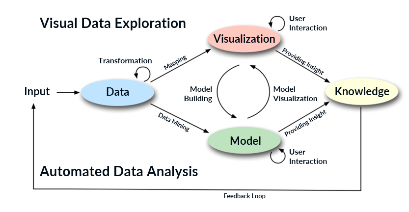 Visual analytics process[3][5]
In most cases, heterogeneous data sources are the input used for the visual analytics process. Therefore, before applying visual or automated analysis methods, the data needs to be preprocessed and transformed first. This process is indicated by the transformation arrow in the figure above and includes preprocessing tasks such as data cleaning, data selection, and data integration that are necessary in order to make the analysis methods applicable to the dataset. After preprocessing and transforming the data, the user has the possibility to select between applying visual or automated analysis methods.
In case automated analysis is applied first, data mining methods are used in order to generate models of the original data. Once a model is created the user needs to evaluate and improve it. Visualization can be used to interact with the automated methods by refining parameters or selecting different algorithms for analysis. Finally, model visualization is applied to verify the finding of the model. The alternation between automated and visual methods is typical for the visual analytics process and enables the continuous evaluation and refinement of preliminary results. This leads to an early discovery of incorrect and misguiding results and significantly improves the overall outcome of the analysis.
If the user chooses to perform visual exploration, the data is mapped as a first step. After that, interaction with the visualization is needed to discover insightful information. This can be done by zooming in on data areas, exploring different data views, etc. Findings from the visualization can then be used to build a model for automated analysis and validate the initially generated hypotheses.
The arrows connecting Visualization to Knowledge and Model to Knowledge in the figure above show that the use of visual and automated analysis methods provides insight to the user and generates knowledge. As it can be observed in the figure, it is also possible that the user obtains the desired knowledge directly after mapping the data or applying automated analysis. However, in most cases the initial result may not be sufficient, especially when big data with heterogeneous characteristics is analyzed. Hence, user interaction with the visualization or the automated methods is required and model building or model visualization need to be applied as a next step. In summary, in the visual analytics process knowledge can be obtained from visualization, automated analysis, as well as the interaction between visualizations, models, and users. The feedback loop then stores this knowledge in the system and enables better and faster decisions in the future. The combination and interaction between visual and automated analysis methods allow continuous evaluation of the results and are the main characteristic of visual analytics that differentiates the process from other processes for data analysis.[6]
[1] Shneiderman, B. (1996) ‘The Eyes Have It: A Task by Data Type Taxonomy for Information Visualizations’, IEEE Symposium on Visual Languages. Boulder (Colorado), September 1996. pp. 336 – 343.
[2] Keim, D., Mansmann, F., Schneidewind, J. and Ziegler, H. (2006) ‘Challenges in Visual Data Analysis’, Tenth International Conference on Information Visualization. London, England, July 2006. pp. 9–16.
[3] Keim, D., Mansmann, F., Schneidewind, J., Thomas, J. and Ziegler, H. (2008) ‘Visual Analytics: Scope and Challenges’, in Simoff, S., Böhlen, M., and Mazeika, A. (eds.) Visual Data Mining. Berlin, Heidelberg: Springer, pp. 76–90.
[4] Keim, D., Mansmann, F., Oelke, D. and Ziegler, H. (2008) ‘Visual Analytics: Combining Automated Discovery with Interactive Visualizations’, Discovery Science. Berlin, Heidelberg: Springer. pp. 2–14.
[5] Keim, D., Kohlhammer, J., Ellis, G. and Mansmann, F. (2010) Mastering the Information Age: Solving Problems with Visual Analytics. Goslar: Eurographics Association.
[6] Sun, G.-D., Wu, Y.-C., Liang, R.-H. and Liu, S.-X. (2013) ‘A Survey of Visual Analytics Techniques and Applications: State-of-the-Art Research and Future Challenges’, Journal of Computer Science and Technology, 28(5), pp. 852–867.